“More freedom for more readability
Today, let’s take a look at the possibilities offered to modify the display of the pages and offer you a greater comfort of work.
Why improve the display of the panes?
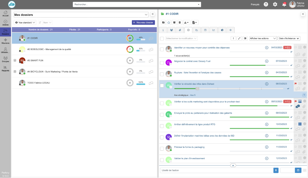
Many Perfony workspace pages are composed of 2 panes: one on the left with lists (action list, meeting list, user list etc…) and the other on the right to display the details of an item selected in the left pane.
Depending on the use, it may be necessary to give more space to one of the flaps for better readability. But what is comfortable for meetings, for example, is not necessarily comfortable for files or action plans.
How to improve the display of my files and actions
Adjusting the flap separator
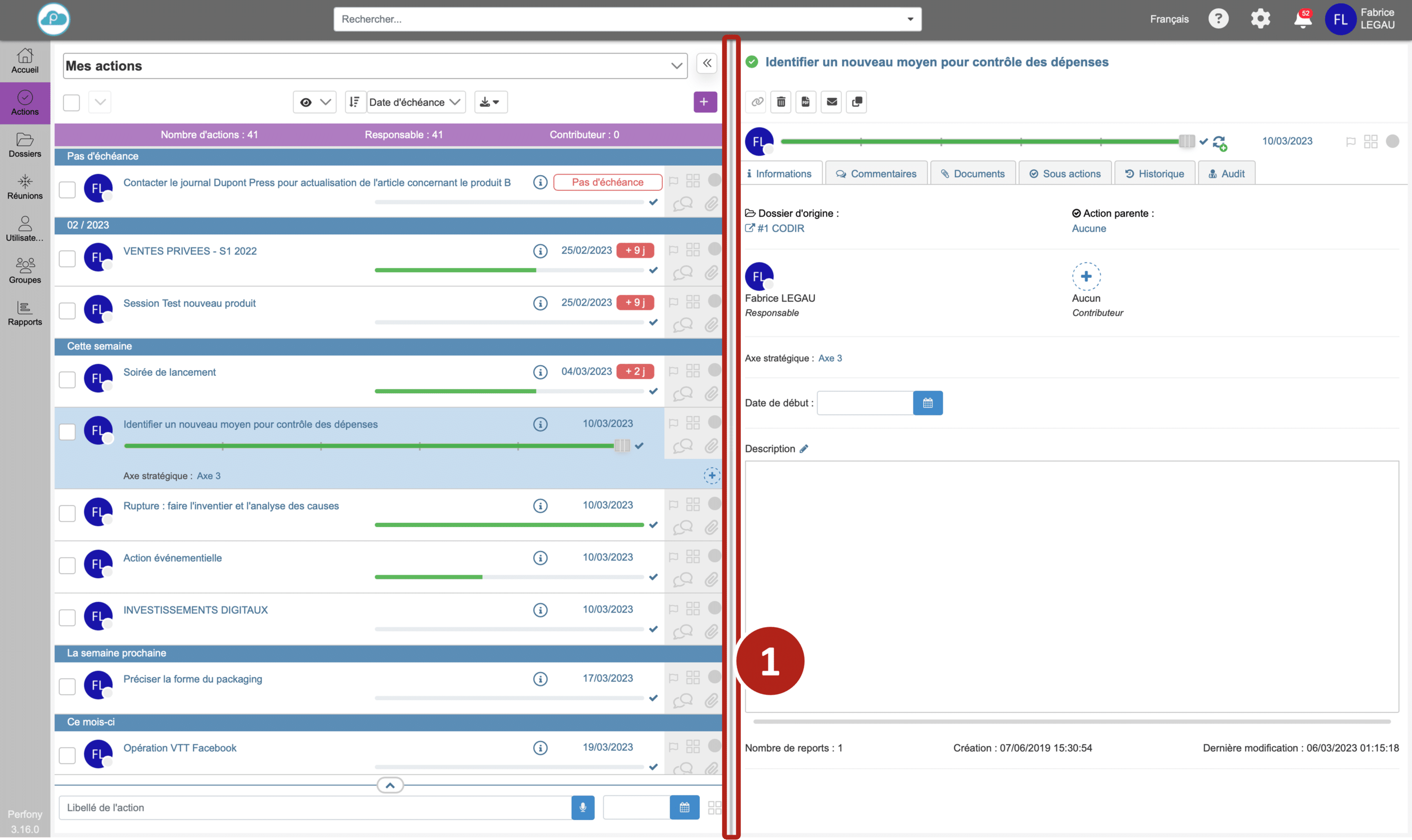
By default, both panes have the same width.
Hover over the vertical separation bar . Your mouse pointer will change its appearance .
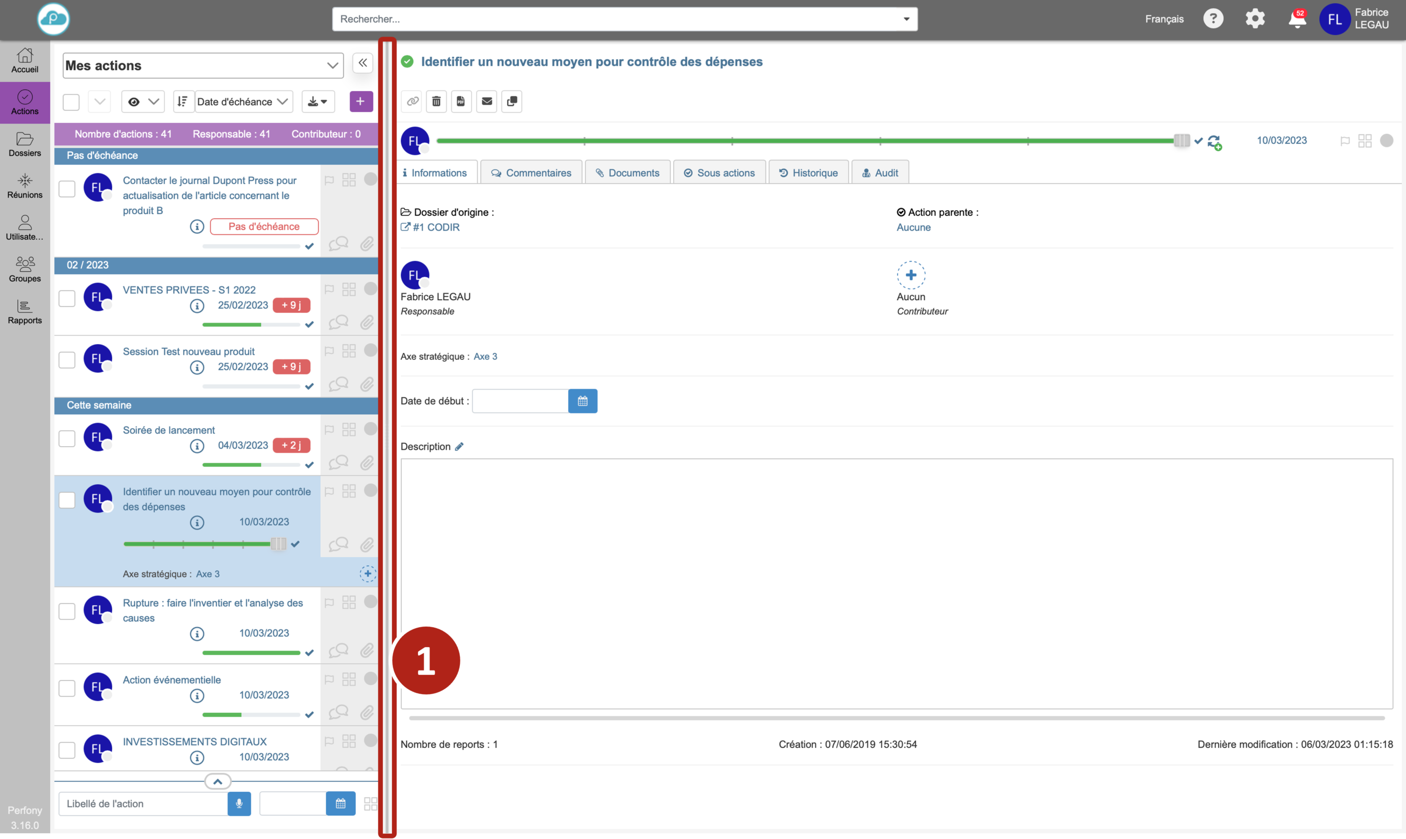
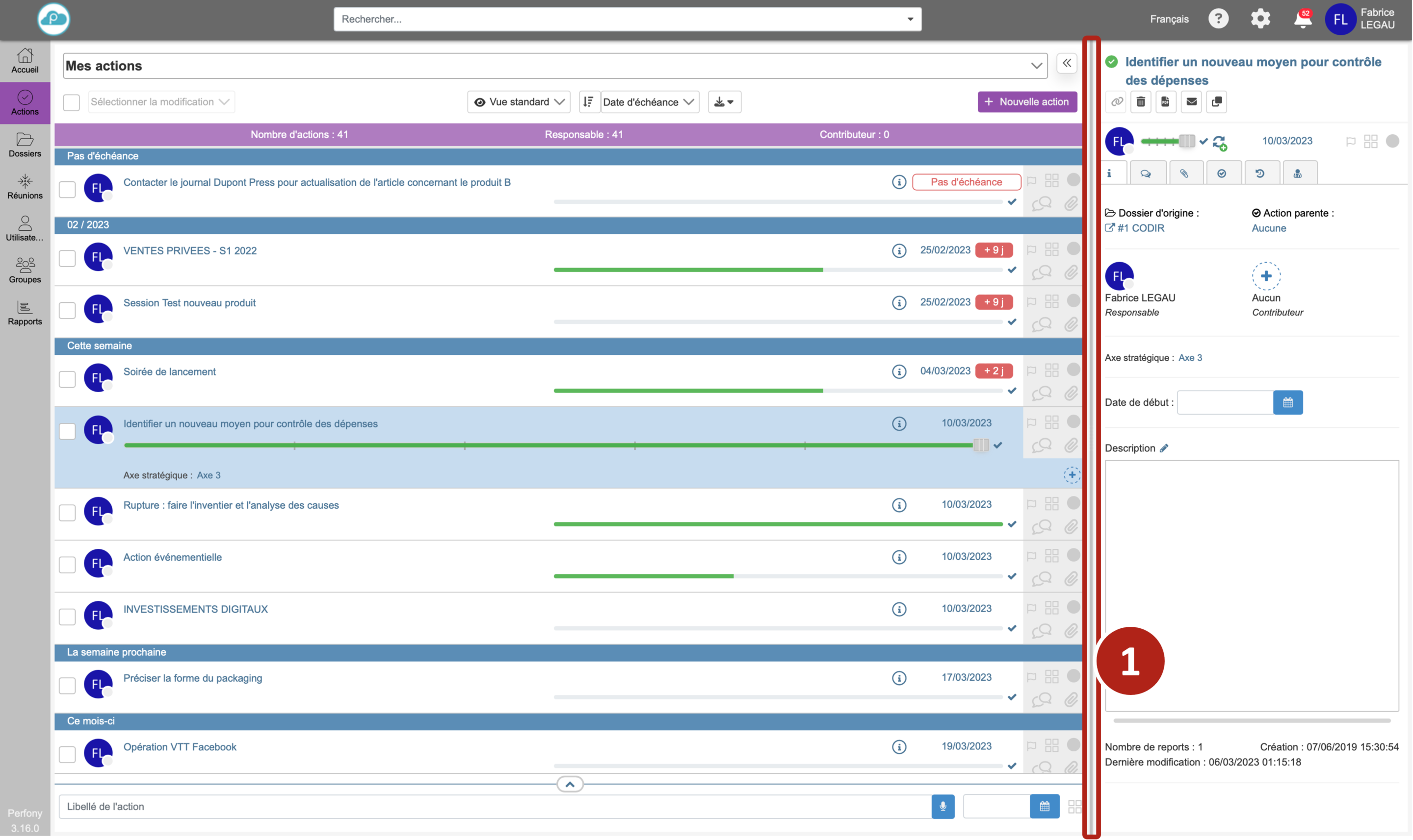
Click and drag the vertical separation bar to the right or left while holding down the mouse button.
Nota bene 1
This operation can be changed at any time and as many times as you like.
Nota bene 2
The width of the panes will be preserved for the rest of your use, until your next modification.
Reduce a pane
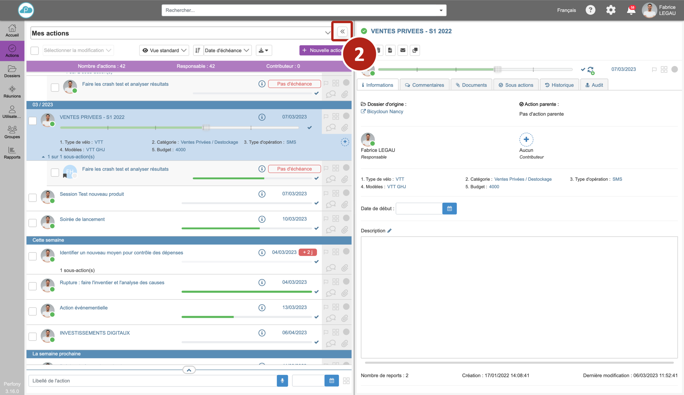
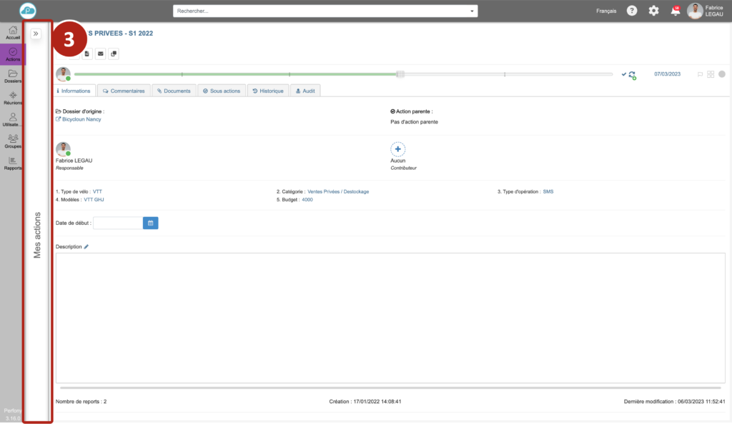
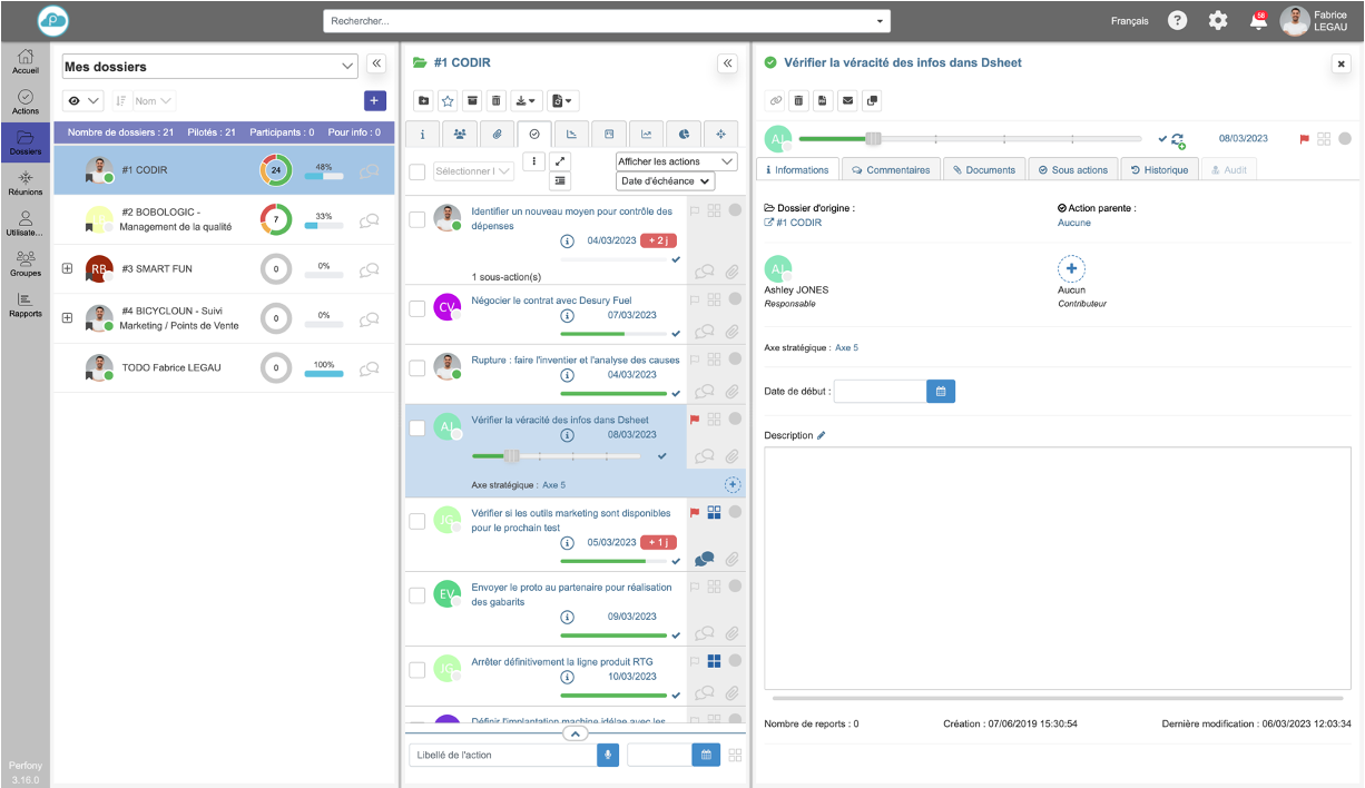
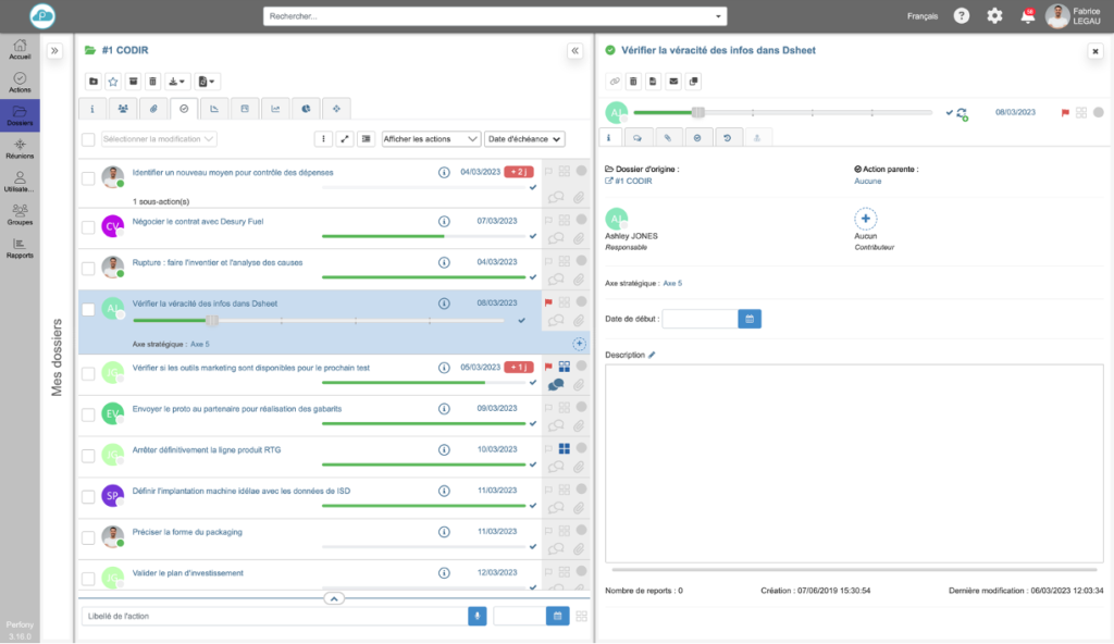
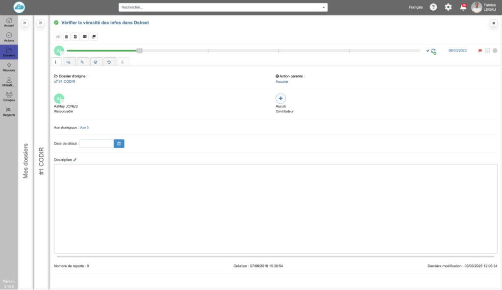
New in version 3.16 of your Perfony workspace, it is now possible to “minimize” a pane to leave as much space as possible in the work area.
To collapse a pane, click on the icon at the top right of the pane.
Nota bene 3
It is of course possible to manually resize the panes and then use the minimize/unfold buttons.
Use the 3-way navigation
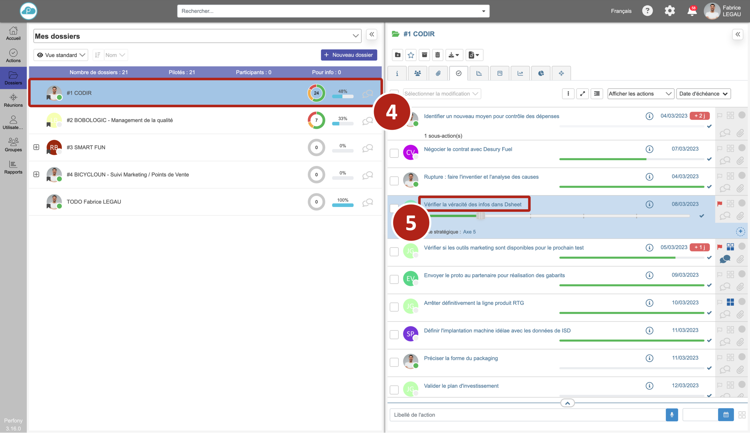
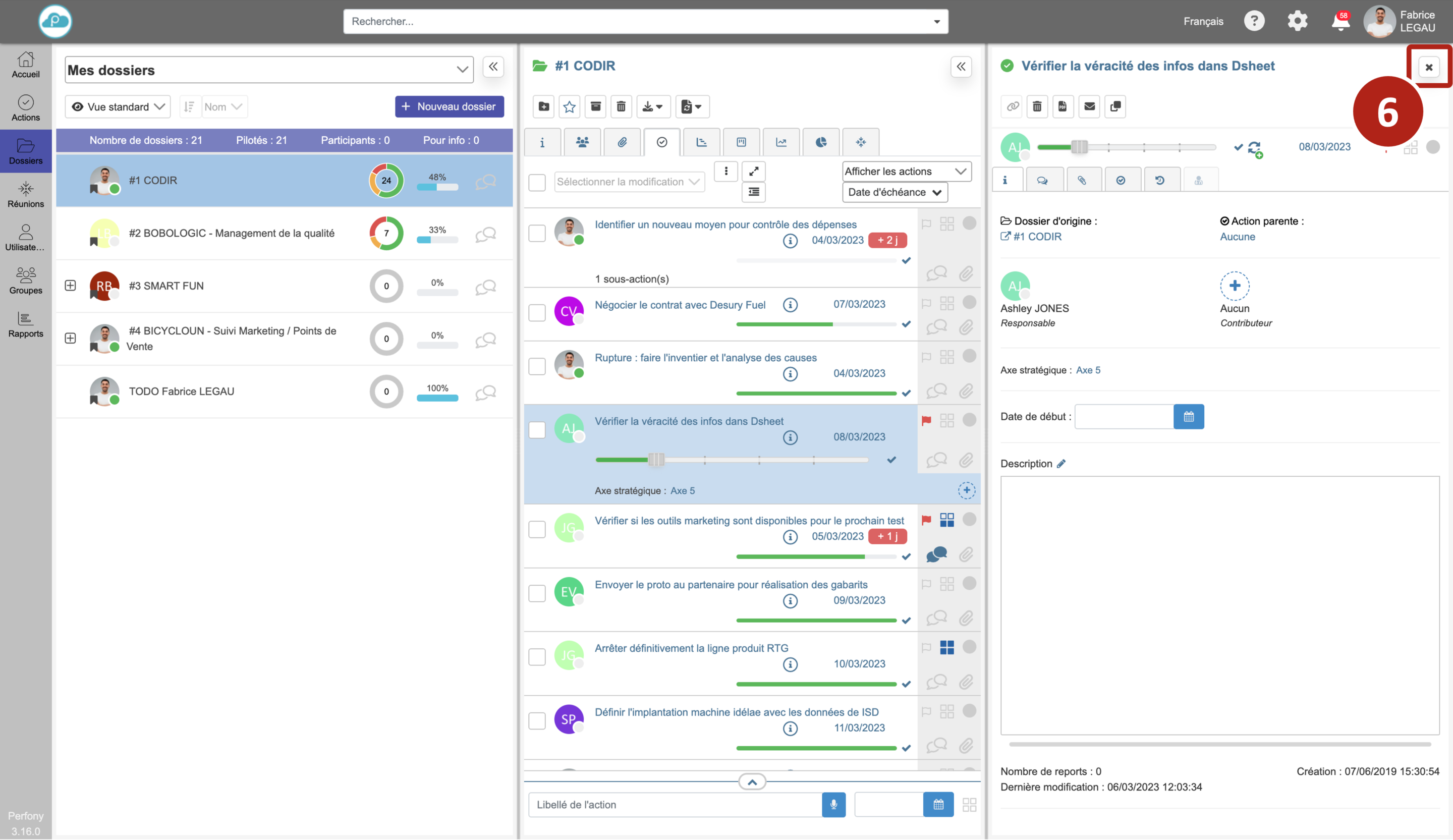
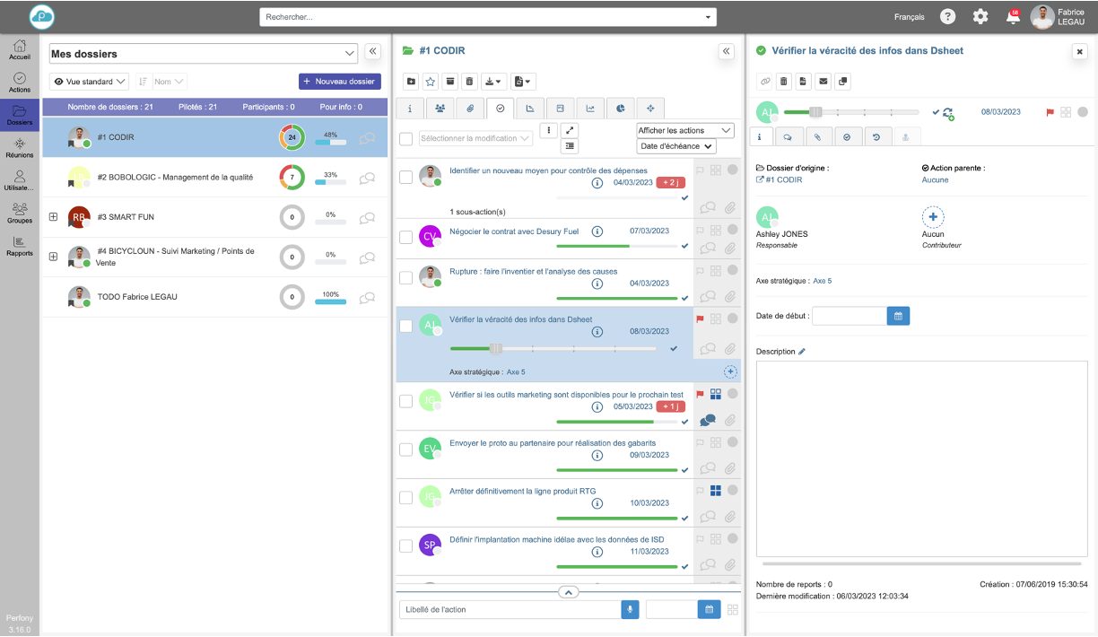
In the folder menu, the navigation offers a third pane to facilitate your navigation by displaying the details of the actions.
When the menu is opened, only two panes are visible.
Select the desired folder , then click on the name of the action .
This third pane can be closed by clicking on the close cross at the top right of the pane .
Nota bene 4
The two panes layout options seen above are of course still available to create the display that suits you!
